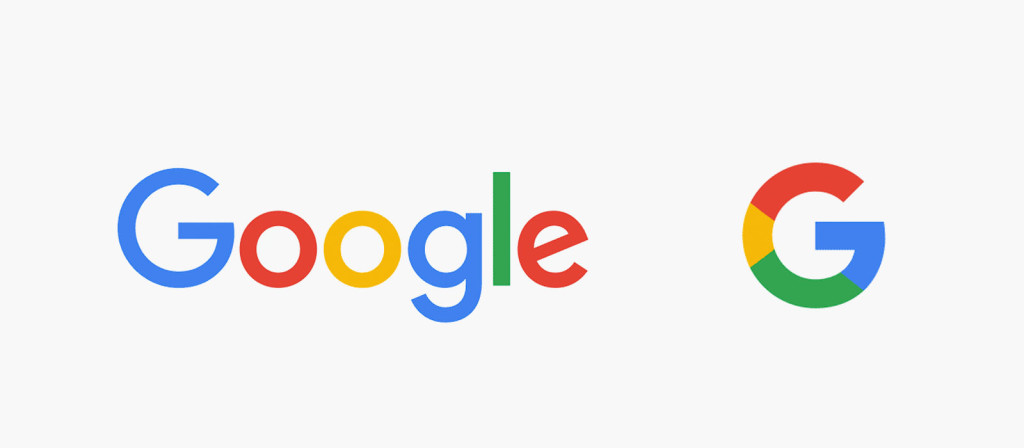
Google seems to be going through many internal changes these days, with a new company Alphabet that will own Google itself as well as a new CEO. Their latest change is the redesign of their logo and visual identity, which was announced today on their blog.
Google’s colorful and simple logo has been with us for quite a while in its current iteration and was getting slightly long in its tooth. The new logo retains the basic structure and look but rids of the serif font in favor of a more modern sans serif font. The shortened logo, which for a long time has been a lowercase ‘g’ will be replaced with a more colorful capital ‘G.’ All of these changes are to better reflect the our changing times, from a desktop oriented computing experience to a more mobile environment.
For those that are less interested in design, these changes may seem minimal and trivial at best. However, when individuals follow the latest fashion trends, why shouldn’t the face of a company change with the times as well; especially when its a powerhouse such as Google.


